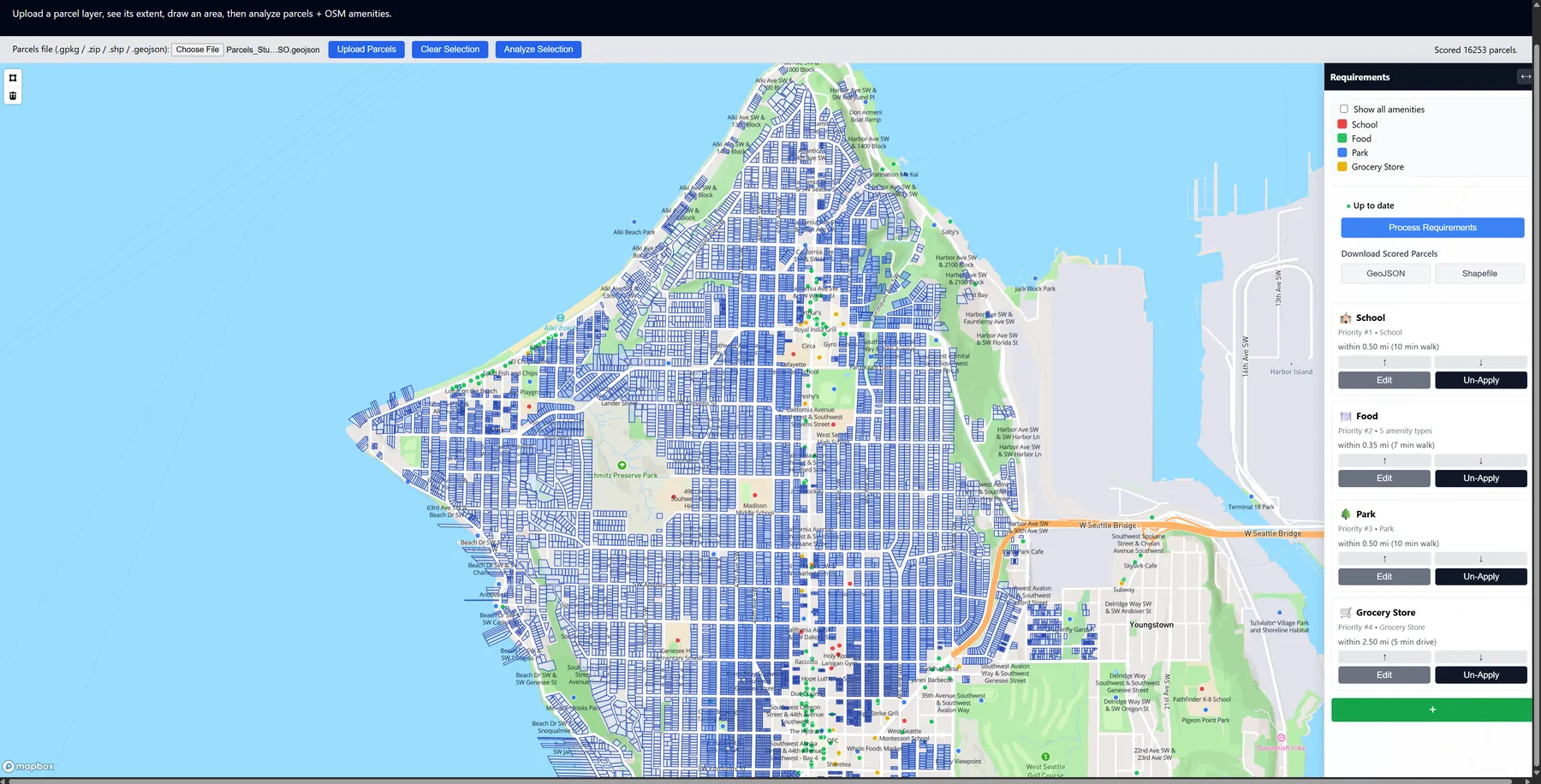
The Parcel Web Analyzer is a web-based tool that helps users compare residential parcels in the Seattle area using their own proximity-based requirements. It combines King County parcel polygons with live OpenStreetMap amenities, scores each parcel with a custom weighting algorithm, and explains why a parcel scored well.
The idea
This project was inspired by my sister’s recent home-buying search in Seattle and the criteria she shared: walkability to restaurants, access to parks and trails, and proximity to daily amenities. Her notes directly shaped the suitability factors I analyzed.
The question I wanted to answer was: which residential parcels in Seattle best match a person's home-buying requirements, and how does that suitability change across the city?
How it works
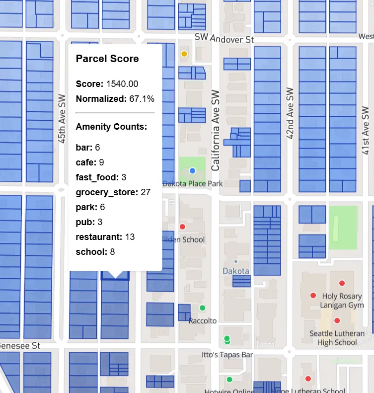
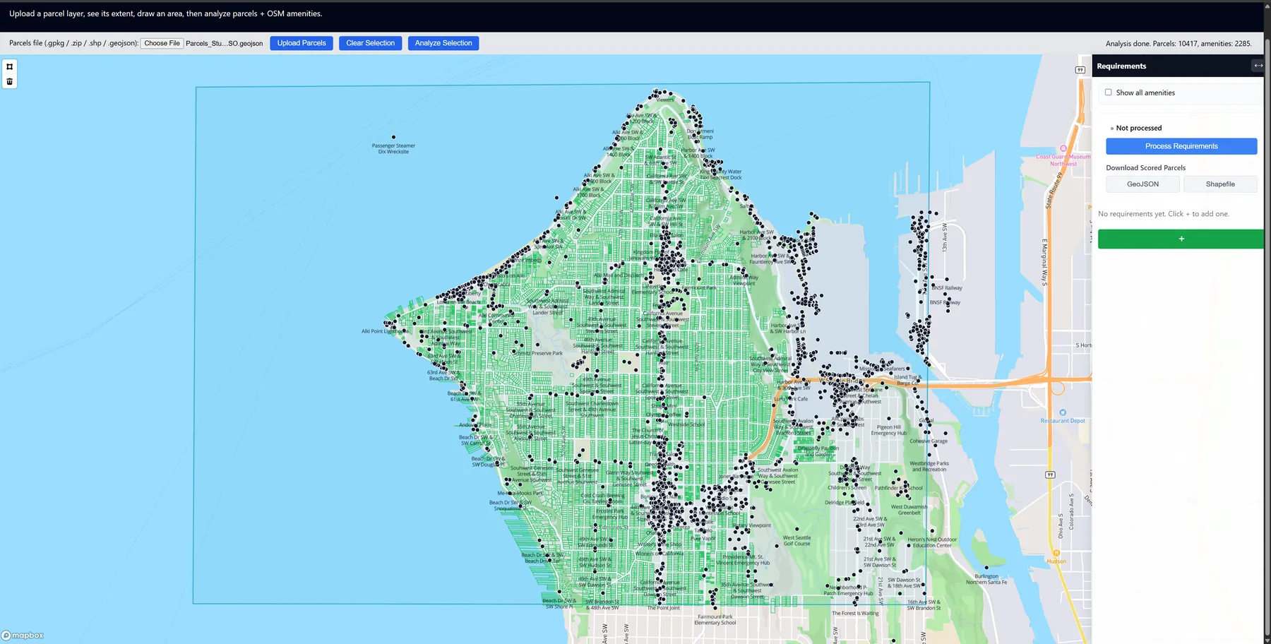
Users load parcels, draw an area of interest, fetch nearby amenities from Overpass, build and reorder requirement groups, and then process the scores. Clicking a parcel shows its score and the count from each requirement group, so the result is explainable instead of just being a color on a map.
For each group, the app filters the included amenity types, buffers each amenity by the chosen distance, spatially joins those buffers to the parcels, and counts the intersections. Priority is handled with triangular weighting, so the first requirement has the most influence and each lower priority contributes less.
The original King County dataset includes more than 500,000 parcels across many land uses. I used ArcGIS Pro to clip the study area and filter it down to residential parcels before loading it into the web app.
What the results showed
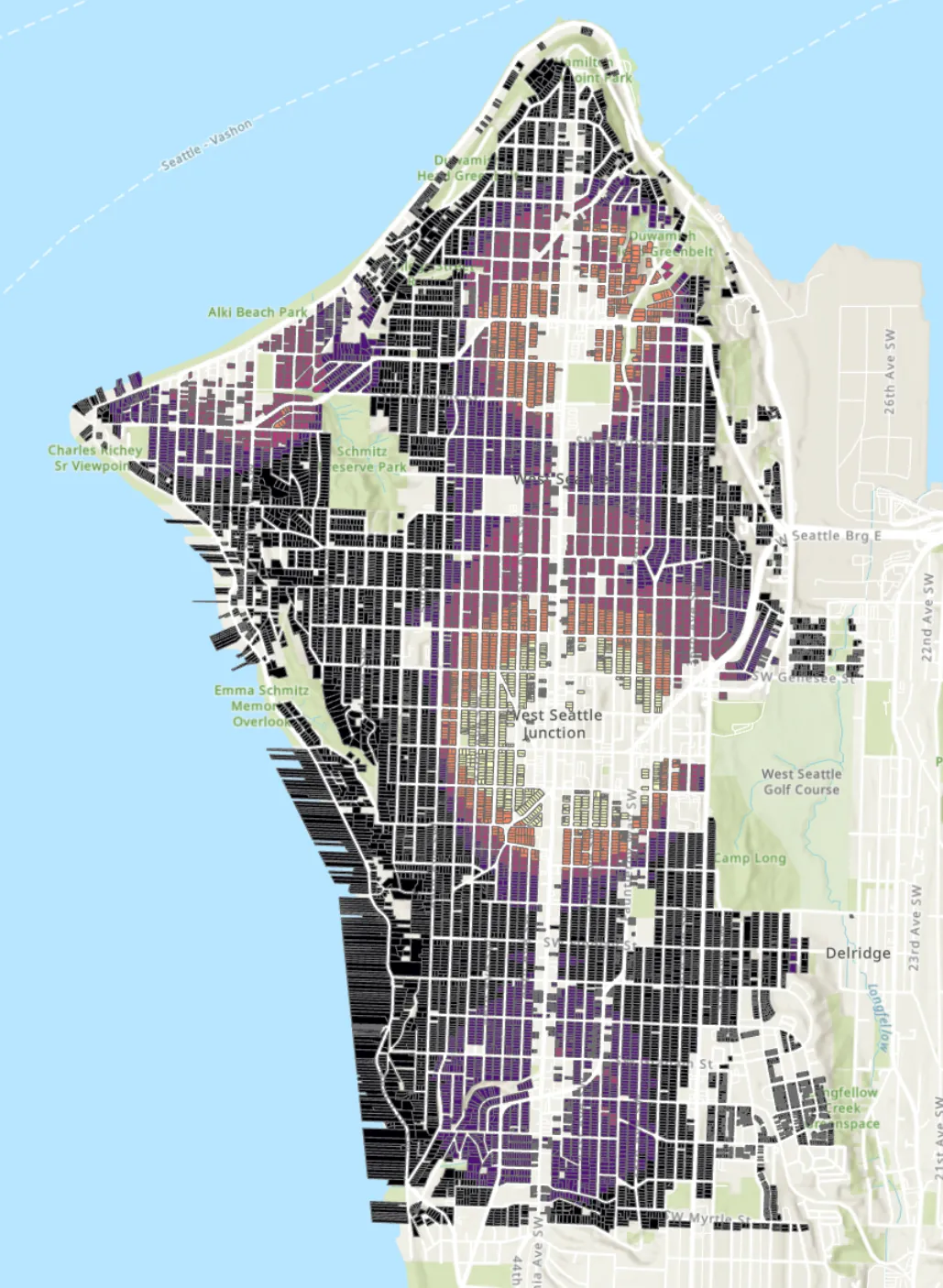
High scores formed clusters in mixed-use areas. Homes near main streets with many restaurants scored higher, showing where businesses and amenities are concentrated.
The chosen distance made a large difference. Smaller walking distances such as 0.25 to 0.5 miles produced sharper contrast, while larger distances spread high scores more broadly. When food was the top priority, parcels near commercial clusters could score very highly even when that conflicted with a preference for quiet streets.
The app exports the scored layer as GeoJSON or Shapefile so the output can go back into a GIS workflow.
What I learned
Preprocessing mattered as much as the algorithm. Clipping, filtering, and exporting in ArcGIS Pro were essential to making the interactive analysis usable.
I also learned how much a good interface changes a GIS tool. Operations that feel complex in ArcGIS can become much easier in a guided workflow. Building it made me think about all the GIS tools we take for granted, such as Google Maps, and how important it is to plan the interface around what someone is trying to do.